#purple splatter vinyl
Explore tagged Tumblr posts
Text

Prince - Purple Rain (LE 40th Anniversary Purple Splatter Vinyl)
#prince#prince and the revolution#purple rain#limited edition#purple splatter vinyl#tafkap#lp#vinyl#record#album#40th anniversary#33 1/3
8 notes
·
View notes
Text

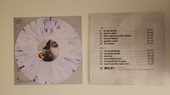
No Good Left To Give by Movements
#No Good Left To Give#Movements#Movements Band#Fearless Records#Pretend Popstar#Vinyl Collection#Vinyl Collector#Record Collection#Record Collector#Orange County#Emo Music#Post Hardcore#alternative#Alternative music#Indie music#purple splatter
9 notes
·
View notes
Photo
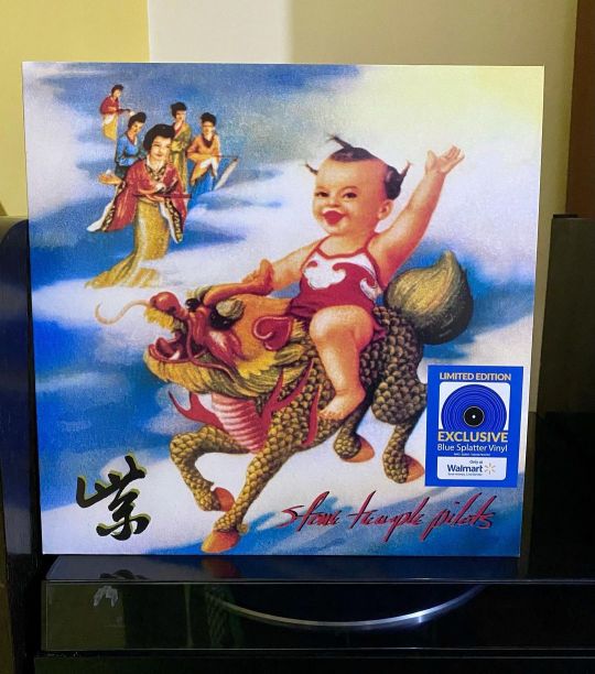
Buen jueves para todos Y para hoy, el #ViniloDelDía llega con una de mis bandas favoritas @stpbband y su segundo álbum de estudio #Purple lanzado el 7 de junio de 1994 en Atlantic Records. Un icono del grunge con sus 47 minutos de duración, este #longplay en edición #splatter de #WalmartExclusive es un super super disco que, junto con el CORE son mis 2 álbumes favoritos de STP. ¿Qué temas trae? Aqui la lista de canciones 1. "Meat Plow" — 3:37 2. "Vasoline" — 2:56 3. "Lounge Fly" — 5:18 4. "Interstate Love Song" — 3:14 5. "Still Remains" — 3:33 6. "Pretty Penny" — 3:42 7. "Silvergun Superman" — 5:16 8. "Big Empty" — 4:54 9. "Unglued" — 2:34 10. "Army Ants" — 3:46 11. "Kitchenware & Candybars" — 8:06 #vinyl #vinylcollection #discosdevinilo #vinyladdict #vinylcollector #longplay #vinylcommunity #vinyligclub #vinylrecords #vinyloftheday #vinylgram #vinylcollectionpost #vinylcollector #vinyllove #vinylclub #vinylrecord #musicaenvinilo #vinyllover #tornamesa #VinylLife #tocadiscos #vinylcollective #discodeldia #melomano #musiclover #musica #discosdevinilo #vinilos Dato curioso: El título del álbum, "Purple", se escribe como un Chinese character, zǐ (紫), en la portada, y en ninguna otra parte en el envase (con excepción del Reino Unido y el lanzamiento europeo del vinilo de edición limitada). No hay lista de pistas en la parte posterior de la caja, sino que muestra una imagen de un pastel con la frase "12 Amables Melodías" En la portada de la versión de casete de la púrpura, el niño está sosteniendo el carácter chino en la mano, y no está en la esquina. Hay dos prensados del disco actual en Purple CDs. Una versión tiene flores en él y otro tiene escamas de dragón. El comunicado de LP de vinilo está hecho de color de vinilo - púrpura transparente en el estreno en Estados Unidos y Reino Unido, y una edición limitada de vinilo opaco de mármol en un tono más suave de la púrpura disponible sólo en el Reino Unido y Europa. https://www.instagram.com/p/CovUqxxP0WD/?igshid=NGJjMDIxMWI=
#vinilodeldía#purple#longplay#splatter#walmartexclusive#vinyl#vinylcollection#discosdevinilo#vinyladdict#vinylcollector#vinylcommunity#vinyligclub#vinylrecords#vinyloftheday#vinylgram#vinylcollectionpost#vinyllove#vinylclub#vinylrecord#musicaenvinilo#vinyllover#tornamesa#vinyllife#tocadiscos#vinylcollective#discodeldia#melomano#musiclover#musica#vinilos
0 notes
Text
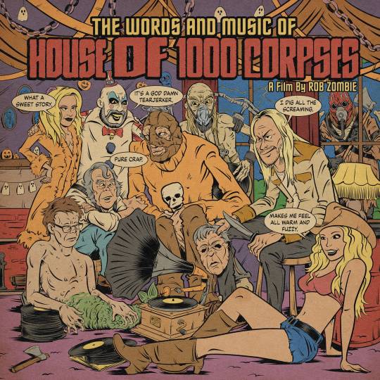
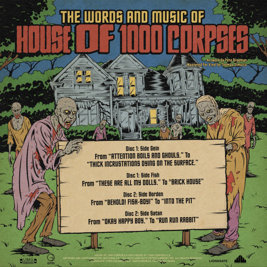


The Words and Music of House of 1000 Corpses - featuring the complete audio from Rob Zombie's 2003 directorial debut on 2xLP vinyl - is available for $50 from Waxwork Records.
Shipping in April, the album is pressed on two color variants: "Captain Spaulding" (clear and blue swirl with red and white splatter) and "Halloween Party" (orange, purple, and green swirl).
It's housed in a gatefold jacket with matte satin coating featuring art by Pete Bregman along with a 28-page 11x11 companion comic, printed inner sleeves, character cut-out sheet, and fishboy fortune teller.


#house of 1000 corpses#rob zombie#captain spaulding#sid haig#bill moseley#sheri moon zombie#horror#waxwork records#vinyl#gift#otis driftwood#baby firefly#karen black#pete bregman
87 notes
·
View notes
Text
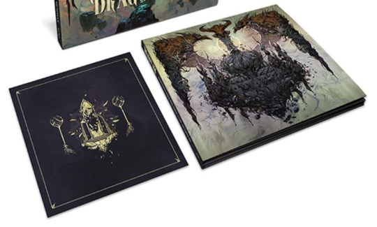
In a recent email from Spacelab, there is some new info on Dragon Age/potentially on DA:D, and on the DA vinyl.
first of all, a simple thing - as part of the pre-sale, there will be additional merch available, including a t-shirt and art print, of the beautiful vinyl cover art piece:

secondly, the official names of these two vinyl color variants/patterns have been given. the turquoise and gold one is named "Golden City" Merge, and the golden one with black 'explosion'-style lines is named "Black City" Splatter - artfully bookending/contrasting Thedas' past and the present, the Golden City and the Black City, the pre-Veil world with the world post-Veil:

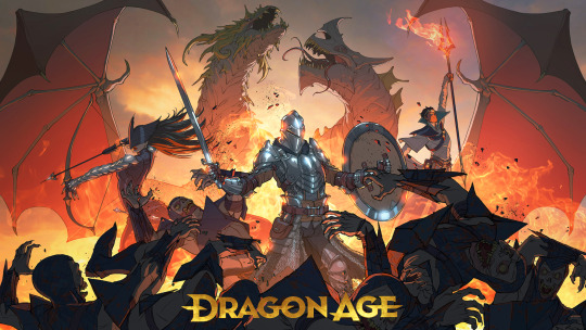
in a previous post I mentioned that the first one reminds me of an eclipse, and the second one reminds me of an explosion. with the reveal of the naming of these two color variants, I've finally realized what both 'color swatches' remind me of, and it's Trespasser, or rather the key art for Trespasser.

you could easily imagine the palettes for both color variants being sampled from or inspired by this image or ones/DA settings like it, right? the Trespasser key art also includes element of both patterns - the sunbeams emanating as the dragon's 'wings' remind me of the 'exploding' lines in "Black City" Splatter, and the light/dark color contrast, bright light and splotchy patterns of the clouds along the top of the dragon's 'wings' remind me of the design of "Golden City" Merge. for me I found being reminded of the Trespasser key art interesting, as in it the eluvians are teal/turquoise, like the color in "Golden City" Merge - whereas eluvians are sometimes (not always) colored purple or shown with a purpley 'tone' in the setting. idk, I just found that interesting :) other feelings that I had from these were 1) that in "Black City" Splatter, the black (Blight, corruption, Taint) lines extending outwards made me think of the Taint entering the world and corruption spreading after the City was blackened and corrupted. and 2) that in the "Golden City" color variant, the two colors are turquoise/teal and gold. to "merge" implies mixing something together to create something new. in the setting, green is a color often associated with or used to represent the Fade - there's the Anchor, the "emerald waters", the green glow of Veilfire, the general green tinge often present in depictions of the Fade, etc. and if you merge or mix turquoise and yellow, you get green. hh, its probably overthinking, but I just thought it was fun/neat the different thoughts and feelings the images/art & their names bring to mind. :)
oke so, as a reminder, we had also previously seen official flavor text for the cover art, describing it thus: "The beautifully detailed artwork presents a pictorial timeline following the lore of the Dragon Age series, beginning at the dawn of the Golden City, throughout the City’s Fall and culminating in its re-emergence as the Black City, seat of the Old Gods" and "From the land of Thedas, at the dawn of the Golden City". in the email, there is also an image containing two all-new art pieces:
on the left, in the black and gold color themeing that we've now become so familiar with (one, two, three) is a picture of a shattering eluvian. the eluvian sits on a Fadey-style floating rock piece. it's the 'tri'-style of eluvian (highlighted in purple below), rather than one of the simpler single archway-style eluvians. this is the style of eluvian that Solas meets Flemeth in front of in the post-Trespasser scene. it's always been an interesting eluvian shape - like the shape you'd get if a 'simple' arch eluvian was flanked on either side by beasts (wolves, dragons, or one of each), or the shape a stylized dragon could make if looked at front-on with its wings folded, like in this dragon Mythal mosaic or this Mythal dragon statue. it also resembles the shape of the shrine to Fen'Harel in the Crow Plains. the shattering is also interesting - shards of glass fly outwards from the center, thereby resembling "Black City" Splatter. shatter, splatter, "and I looked up and saw the seven gates of the Black City shatter, and darkness cloaked both realms"... are those clouds of smoke in the background? what's caused the mirror to shatter - an explosion? just what is this scene depicting or representing? lastly, the shattering eluvian is flanked by two of those familiar ancient elven 'tree' sculptures (highlighted in yellow below). this is a familiar scene, no? there have been various theories/speculations over time about these DA:I 'trees', what their purpose was/is, what they are/what they represent. for example, Mythal vallaslin resembles branches without leaves, and on the front of Flemeth's grimoire is intricate stitching in the pattern of a leafless tree.

the second new art piece, on the right, is a variation of/accompanying piece to the cover art. they should be compared side by side. Twitter user Hrungr was able to manipulate the image of the second new art piece to be front-on, and here it is on the right compared to the 'original' [image source]:
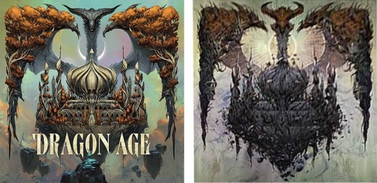
suddenly, the pre-existing artwork blurb and the color variant naming choices make sense. :) on the left is the Golden City, as it was. pure and uncorrupted. sculpted and shining, splendid and supporting growth/life. on the right, the Black City, having been blackened and corrupted. Blighted, blackened, dying, crumbling. gnarled and withered (...leafless...?), dark and sinister. "a pictorial timeline" of Gold->Black City indeed. we've seen this motif play out many times now, from the DA:O opening cinematic voiced by Duncan right through until the in-game Dragon Age: Dreadwolf cinematic that came out a few months ago.
these two versions of the City echo the color variants & patterns. :) in one, the Golden City with a cloud-like pattern in a teal/turquoise sky, and in the other, a golden setting ruined by blackness and 'faultlines', emanating out from the center.
apart from the obvious Gold to Black change, there are some other differences between these two pieces to unpack. on the left is a hooded figure on rock promontory, holding a horned or moon-like staff while looking at the dragon. this figure is absent after the City's blackening. on the right, that rock promontory and the other floating rocks are absent, presumably having fallen or crumbled away after the 'ruining'. on the left, in the center behind the dragon is a half moon-like shape. on the right, this changes to a sun-like golden disc complete with sunbeam-like 'rayed lines' emanating from it. the eclipse-like imagery of these is obvious, and the disc with rayed lines is an element we have seen before in the updated DA logo.
here it would be silly not to revisit previous related references and imagery such as:
two shadowed spheres among stars / an eclipse as Fen'Harel stirred [the Emergent Compendium]
and
and I looked up and saw the seven gates of the Black City shatter, and darkness cloaked both realms.
there is also the eclipse-style imagery in the in-game Dragon Age: Dreadwolf cinematic and a bunch of previous sun/moon motifs/references floating around e.g. Dalish lore holds Mythal created the moon and was born of the sea (so a moon connection there via the tides), and that Elgar'nan opposite her is the Eldest of the Sun, the guy who buried the Sun, the Pools of the Sun etc. also those art assets of overlapping spheres, repeating/concentric circles etc.
I also would like to highlight that it's either two different dragons we're seeing, or that the dragon changes at the corruption of the Black City. is the dragon on the right a depiction of inworld lore of an Old God becoming corrupted? or is something Evanuris-y afoot? (dragons, a shape "reserved for the divine" etc). who do/does the dragons represent? who is the figure with the staff?
additionally, the horns and general structure of the dragon is totally different on the right than it is on the left. the first thing this reminded me of was the "Double Blight???" DA:D concept art piece 👁️ -
the differences in the horns also reminded me of this stuff:
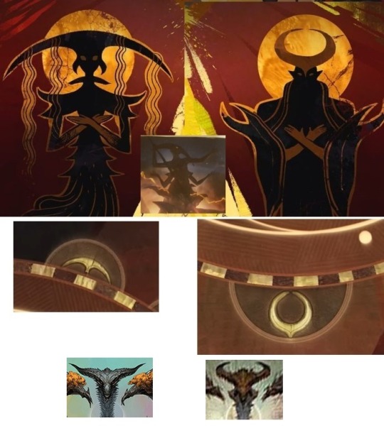
I'm not saying both dragons' horn shape match these, just that one seems to and that there's something going on here with all this anyways. there are of course other symbols around the outside of that ring beside just these two, and other types of dragon, including the style/type of dragon associated with Mythal.
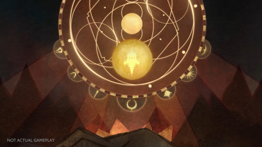
the shape of the figure's staff is also curious, given all this.
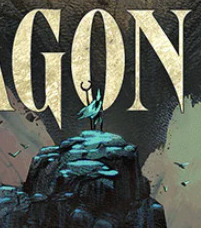
left, silvery dragon - Mythal? right dragon (which is gold-toned despite the blackening) - Elgar'nan, after he's approached her [maybe as the figure on the rock promontory] and then murdered her and taken her place as the god, ruler, dragon who presides over all? moon and sun, moon dragon and sun dragon, beauty and destruction.. the shape of the 'right-hand' dragon's horns match the evanuris headpiece on the ring which is in the biggest hemisphere, and of the 7 gods those headpieces apply to (9 Evanuris, minus Mythal and Fen'Harel), the 'biggest' naturally is the patriarch leader opposite Mythal, Elgar'nan.
And so is the Golden City blackened With each step you take in my Hall. Marvel at perfection, for it is fleeting. You have brought Sin to Heaven And doom upon all the world. --Threnodies 8:13
🌙 ◕‿◕ ☀️
#dragon age: dreadwolf#dragon age 4#the dread wolf rises#da4#dragon age#bioware#video games#long post#longpost#solas#mj meta#pls this post is just wild speculation for fun ok
168 notes
·
View notes
Text
why dont artists put as much effort into pretty colours for cds as they do for vinyl. like yes pink splatter blue splatter translucent green yellow with glitter clear with mysterious liquid purple with images on the outer edge so it looks like a dot gif. why do cds just get the album cover its so boringgggg give me funky patterns or give me death
8 notes
·
View notes
Text

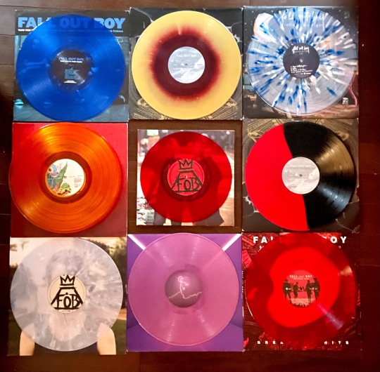
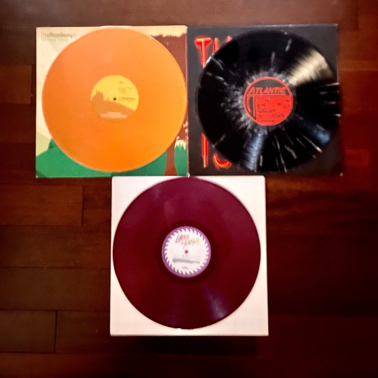


ATTENTION BANDOM ❣️ i am selling my vinyl collection.
Shipping is $7.50 for US. None of these have been tested so I'm not sure about skips! I accept P*yP4l and v3nmo.
Dm me if interested here, on twitter at miseryloved, or instagram at lamictalgirl. Offers are welcome but these are my prized possessions and a lot of them are rare so I am going to be very selective with my prices! Please reblog for exposure it'll help a lot!
List under the cut <3
FALL OUT BOY
take this to your grave translucent blue 2009 pressing ☆ $300
from under the cork tree maroon swirl pressing (very tentative to sell this) ☆ highest offer $150
from under the cork tree red/black split 2018 ☆ $100
infinity on high white and blue splatter vinyl (very tentative) ☆ highest offer $150
folie à deux red + orange first 2008 pressing ☆ $120
believers never die yellow vinyl (unopened) ☆ $35 price firm
save rock and roll red translucent 10inch ☆ $55 price firm
american beauty/american psycho light blue ☆ $35 price firm
mania purple swirl 2018 original press ☆ $55 price firm
believers never die part 2 red/white vinyl ☆ $45 price firm
THE ACADEMY IS
almost here orange vinyl ☆ $80
santi black + white splatter vinyl ☆ $45
COBRA STARSHIP
kiss my sass purple vinyl ☆ $60
IDKHOW/THE BROBECKS
1981 ep ☆ $100
razzmatazz opaque orange ☆ $60
HALSEY
room 93
☆ $100
hopeless fountain kingdom
☆ $65
manic
☆ $40
if i can't have love i want power
☆ $60
HAYLEY WILLIAMS
☆ petals for armor pink UO exclusive
☆ $100
#fall out boy#bandom#vinyl#fob#pete wentz#patrick stump#collection#records#the academy is#william beckett#cobra starship#gabe saporta#idkhow#the brobecks#dallon weekes#tttyg
179 notes
·
View notes
Text

Black Magick SS: Rainbow Nights
Rainbow Splatter Vinyl.
Includes a lyrics sheet.
Creep Purple Records.
6 notes
·
View notes
Text


07/31/2024 via instagram
fatherjohnmisty Here we have a compilation entitled ‘I Followed My Dreams and My Dreams Said To Crawl: How I Admit I Didn’t Sign Up for Showbiz To Be Cosmically Knee-Capped By A Karmic Teacher Disguised This Time As The Bathetic Career of a Semi Beloved Fringe Balladeer In The Twenty Teens’, which exists now because over the last year or so, thanks to market forces beyond my comprehension, we’ve had an influx of new listeners. The idea was to offer them a piece of vinyl featuring, hopefully, all the songs they like in one place. Thanks for listening.
‘Greatish Hits: I Followed My Dreams and My Dreams Said To Crawl’ is out now digitally and available for preorder on 2xLP and CD formats.
The double LP package features cover art from Kevin Wong (@/tragicsunshine), liner notes from novelist and screenwriter Bruce Wagner and comes on clear vinyl with green/blue/purple splatter.
#father john misty#fjm#josh tillman#ig#2024#greatish hits#kevin wong#bruce wagner#favorite vegetable#mahe
2 notes
·
View notes
Photo

'Understanding What We've Grown To Be' by We Came As Romans vinyl repress is here. It’s the first one in a decade. It's a white with purple mix/black splatter variant. Limited to 500.
39 notes
·
View notes
Text


odd foxes licking wounds (released: february 6th 1984) | oc band (album edition)
I had the tongue from my Whiplash lyrics post saved as a psd and I decided to do a full 'mock-up' of the album the song comes from - Licking Wounds. It's shortened to either Lickin' or LW, and its full reference name is Odd Foxes Licking Wounds (to make the 'gimmick' they have work). It comes in various formats and comes in both standard colours as well as special edition pink & purple splatter vinyl & translucent pink cassette. A CD version isn't released until 2004 as part of its 20th anniversary re-release. I thought it'd be fun to have someone have the full collection of tapes, both a signed and unsigned art card, and the special edition vinyl that they're "selling" on some site or another in the present day.
#ansicredocs#artzzz#oddfoxesverse#oddfoxesart#ocalbums#oc lore#if u know why that date u hush up lololol
5 notes
·
View notes
Text
is there a particular reason why taylor never gives us a variety in vinyls styles??? like seriously just 3 different shades of purple that are barely different? why can’t we get a splattered mixed? or a streaked mix?
like here’s the variety of pinks for the barbie soundtrack-


9 notes
·
View notes
Note
top 5 vinyl records you own?
Ooh, let's see:
My Chem Conventional Weapons box set (Is that cheating?)
Djo Twenty Twenty 'Red Galaxy' VMP edition
Brand New The Devil and God 'Purple Marble'
My Chem May Death Never Stop You 'White with red splatter' (It's pink...)
Foals Everything Not Saved Will Be Lost 1 'book album set' (It has a violet colored 12 inch, a little 7 inch with etching on the one side and the whole thing is like one giant book. It's so cool. I love it.)
Thank you anon! 😊
10 notes
·
View notes
Note
Embrace
They couldn't really remember much when they woke up in the dark studio. In hindsight, it should have been the first sign something had gone wrong.
It was morning. Maybe. They're not too sure. They took a moment to peel their disoriented self from the not-usually-sticky vinyl flooring. It took considerable effort, it was as if they were completely drained of energy. Even their breaths were labored. They hated it when their brain decided to forget how to do it automatically.
"In..." they whispered as they stumbled towards what they hoped was the light switch.
"And out..." they followed their instructions, pushing air out of what may as well have been balloons full of wet cement.
Their fingers curled around the switch in the pitch dark. The studio work lights flickered on with a low hum, revealing the mess of the studio. They had spent countless nights cleaning up after Diana, but this...this was goddamn excessive.
Dead center was a perfect, them-shaped bloodstain. It was bright red in the center and turned gradually duller and more purple towards its edges. There wasn't a single canvas in the room that didn't have crimson splattered on it. There was a faint smell of a savory aroma that clung to their nose.
They wanted to let out an exhausted sigh, but it was too much effort. A better use of the energy was to go grab a mop and bucket- and make sure this mess is long gone before she wakes up at sundown.
Moments from the night replayed in their mind as they dragged their leaden body towards the closet they kept all their cleaning supplies. She at least did them the courtesy of asking them several times if this is what they wanted and were ready- but Diana was determined. 'No' wasn't really on the table.
Anger swelled in their throat. She always did this. This was just another one of her empty promises. All show and no delivery. And they're too doped up on her vitae to do shit about it--
wait.
Were they... really going to clean up after her again? What if they didn't?
They waited for that pit to hit their stomach. The one that couldn't bear disappointing her. That feeling never came.
A smile crept on their face.
A canvas or five landed on the central blood stain, soaking the blood into it. They pulled out her favorite boar-hair bristle brushes and slashed at the fabric. Despite how heavy their body felt, it was easy to move the oversized canvas around. They could toss it into the air with ease and surprising coordination.
Hours passed. They don't know how they knew, but the sun had set. Their body no longer felt full of lead but, their lungs still needed to be manually told to inflate. On top of that, their stomach felt as if it was turning inside out. They were hungry. Maybe they didn't feel that disappointment pit in their stomach because they hadn't eaten a damn thing all day. Good thing the painting was nearly finished. All it needed was a few finishing touches.
Once it was done, they stood back, admiring their masterpiece. Title? Three faces pulled apart by the red strings of fate. Well.. they can workshop it later. They couldn't help but laugh, they haven't felt this free to make anything in years.
That was short lived. There was the sound of the studio door swinging open, followed by a familiar voice,
"--Quinn? Oh my god you're awake! You're awake?!" she called out. The new fledgling stared back at the figure in the doorway. They were covered in vitae, paint, and held her favorite brushes in a wolverine grip.
Oh. There's that pit.
The half-moon mark in the center would be burned into the canvas the night they were caught and branded. Freedom was real short lived.
#ooc#//thanks for the ask!#quicksilver answers questions#tfw you start cammie and flip the script so hard you lose a few braincells to the dogma
2 notes
·
View notes
Photo


Splatterhouse's original video game soundtrack is available on vinyl for $35 via Spacelab9. Shipping in August, the score is composed by Katsuro Tajima (Tekken 5: Dark Resurrection) and Yoshinori Kawamoto (Tekken 7, Star Fox Assault).
The album is pressed on 140-gram vinyl with two color variants: "Pustulent" green with purple splatter and "Mouldering Mansion" purple with black haze. It's housed in a gatefold jacket with artwork by Shagrat, liner notes from West Mansion: The Splatterhouse Homepage's Rob Strangman, and a 9x11 decoration.

#splatterhouse#horror video games#video game#video games#horror games#namco#bandai namco#bandai#space lab 9#vinyl#gift#arcade#katsuro tajima#yoshinori kawamoto#tekken
82 notes
·
View notes
Text

Happy Friday! Here's your weekly wrap of all the latest New Releases through the doors at Beatdisc. Actually it's been 2 weeks since our last update so there's plenty of new music to sink your teeth into, along with some October releases that have only just come through on vinyl. Open all weekend. Get in touch to make an order!
- Chat Pile - Cool World - $60 (Yellow LP) - High-Vis - Guided Tour - $55 (Oriole LP) - Undeath - More Insane - $55 (Red LP) - Touche Amore - Spiral In A Straight Line - $65 (Rose LP)
- 1 800 MIKEY - Digital Pet - $34 - POND - Stung! - $70 (Splatter Bee LP) - Sarah Blasko - I Just Need To Conquer This Mountain - $60 - The Necks - Bleed - $60
- Fat Freddy's Drop - Slo Mo - $70 (2LP) - Pinhead Gunpowder - Unt - $60 (Red LP) - Halsey - The Great Impersonator - $70 (2LP) - Bright Eyes - Five Dice, All Threes - $70 (2LP) / $75 (Red/Orange Splatter 2LP)
- Elucid - Revelator - $85 - Doja Cat - Scarley 2 Claude - $75 (Bone 2LP) - James Blake & Lil Yachty - Bad Cameo - $70 (Purple LP) - Mustafa - Dunya - $55 (Green LP)
As always there's some late-running titles out today that we should have in the coming week or so. New LP's from King Stingray, Chimers and Primal Scream amongst others, so don't hesitate to get in touch and pre-order.
0 notes